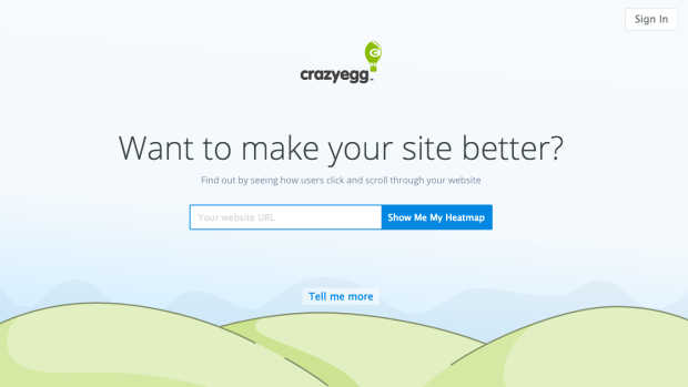
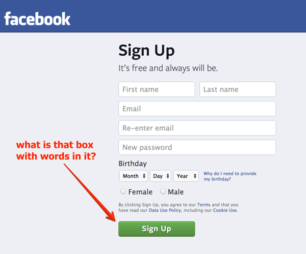
When someone visits your website, what do you expect him to do? – Download your Ebook – share his Email address – watch your webinar or buy your product? Well, it’s obvious that when you invest in your business website, you expect some returns from it and that could only be possible when your visitor performs the desired action on your website. One thing that supports this objective by arousing curiosity among visitors is an effective call-to-action.
Call-to-action (CTA) buttons are the buttons in your website that enable the users to perform certain actions you want them to take in order to move them through the conversion process. These CTAs are often the part of landing pages, whose main objective is to get the web visitors clicking and completing a conversion.
You might have noticed some websites displaying a beautifully created pop-up asking you to sign up for a newsletter; this is one of the most common examples of CTA. Some of the other examples of CTA include:
- Add to cart buttons
- Download buttons
- Free trial sign-up buttons
Now, web audience has become more knowledgeable than ever before and therefore, creating an effective call-to-action has become a challenge for the marketers. To make the people click on them, CTAs must have a compelling substance. At the same time, they should create value for the customers as well.
A Few Misconceptions Held By Small Business Owners Regarding E-Commerce
The following tips will help you create effective calls-to-action for your website:
- Free Trial: A call to action saying “Free Trial” or “Sign up for Free 30 Days Trial” is always enticing and effective. Especially, if you are selling a SaaS based software such as Sales Force, you should consider offering a “Free Trial” of your software for a limited period! You won’t believe, but using the same strategy, Shopify grew its revenue by 10X within 3 years. Use A/B Testing to decide which trial period works best for you: 15-day or 30-day.
- Arouse Curiosity: Curiosity leads to action and in this case – sales. Introduce yourself to people and the products/services you offer, but don’t share every detail about how you do it. Ask them to click on your call-to-action and know themselves. For example, if your company sells a food recipe app, you can arouse a curiosity among people with a call-to-action button saying “Create your Own Recipe” without advertising much about how your app works.
- Make it Action-Oriented: Make your CTA’s action oriented by using action verbs such as “DOWNLOAD” OR “REGISTER”. Such CTAs also make it clear to visitors what they are going to get the next. There are several verbs that you can use according to the intent of your button. When writing your call-to-action, try to integrate these 5 persuasive words:
- You
- Bonus
- Free
- Instantly
- Because
- New
Some Questions About Online Marketing That Often Confuse Marketers
- Aggravate the Problem, Then Offer the Solution: Aggravating the pain points of your target audience make them realize that they need a solution for them. Through your content, make them realize that you understand their challenges. Next, agitate the problem and make them more anxious about it. Then comes the most important step – suggesting a solution for their problem. This is when you can put CTAs such as “Sign Up” or “Get It Now” into action. Make the entire process as simple as possible for your customers.

- Keep Call-to-Actions Minimum: Flooding your website with too many calls-to-action will not bring any miraculous sales to your business. Rather, it would be disastrous from marketing perspective. You need to be focused on limited calls to action in order to avoid any confusion for the users. Divide the calls-to-action throughout your website appropriately. For example, some of the most common buttons you need to implement are, when your customers:
- Finalize a Purchase
- Subscribe to your Email List
- Click through to a Landing Page
- Sign Up for your Newsletter
- Download your White Paper
- Make it Large and use contrasting colors: While good things come in small packages, good calls-to-action come in large sizes. When it comes to creating amazing CTAs, size does play a big role. Bigger will be your call-to-action, more will be the chances of it to get noticed. You might have noticed several sites whose download links dominate the page as that of Mozilla Firefox. These bigger buttons are a lot more enticing and effective than the smaller ones. Also, make your Call-to-action buttons stand out through contrasting colors. Make sure your button is clearly highlighted to make it recognizable. Use brand-appropriate colors for both the background and the button, so they look professional.
- Prioritize your call-to-actions: If you think that adding “Buy Now” button everytime and everytime will bring you sales, then it isn’t correct. Your call to action depends upon the content it is paired too. It also depends on where your prospective customer is in the sales process. For example, if your visitor is reading an introductory blog post, you can’t push him to buy your product immediately. You first need to introduce your brand completely and that can be done by offering them additional content in the form of Ebooks, Whitepapers, Webinars and more.
Maximize Your Sales by Decorating your Online Store for Christmas
The Bottom Line
By now, you’ve probably understood the value of effective call-to-actions and how to create them. A truly effective CTA is that which is created in a right context and shared with the right audience. Always remember, people click on your call-to-action buttons not because they are flashy or animated, but because it offers them something they can benefit from. So, never try to mislead customers by making false promises, they are clicking on your CTA because they are putting a trust on your website. It’s the beginning of someone’s journey with your brand, and it’s your responsibility to make it positive.


