The year 2015 remained quite challenging for the marketers. While some marketing strategies have seen a downfall this year, others emerged as a strong contender. Every year, new trends come to rise in the web design industry and 2015 also brought several tweaks along with for this segment. We have seen changes in design ideas, layouts, patterns, images and other UI elements. Now that we have reached the fourth quarter of this year, it’s time to have a look at all the web design trends of 2015. Let’s see what they are:
- Hero images:
Visuals make the web design more appealing and grab user’s attention more easily. It seems companies are taking this phrase very seriously this year. Forget those days when there were a few tabs and text lines at the top of the home page, as the use of large background images are now dominating this convention. An HD hero image is a large web banner that displays the most important information about your website in a creative way. It puts a powerful impact on your site visitors and make the overall experience very exciting.
- Long scrolling:
Long scrolling has become a common trend in 2015 with the demand of creative one page website. Many users now like this layout as it lets them to scroll easily through the information and they need not to load various pages. Moreover, it lets the companies create a storytelling experience for their visitors. This long scrolling is not limited to one page website only, but now you can apply the same technique to site’s sub pages as well such as about us or product page.
- Full screen video:
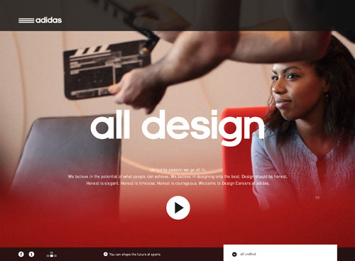
Not only full screen backgrounds, but full screen videos are also gaining momentum these days. Through these videos, companies reflect the ideas and emotions which make the visitors connect more easily with the brand. Users prefer content in a visual format and this can be accounted by the fact that YouTube visitors are growing exponentially every year. In the coming months, this trend will grow even more to build an impression of real life experience.
- Infographics:
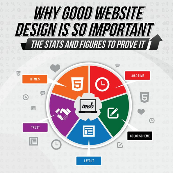
 Text is important and images are engaging. So, the mix of both makes an awesome pair. Infographics gained recognition in 2014 and now they’re continuing to gain traction over web design industry. Users can scroll through these infographics and get the important information easily. It is a sophisticated way to represent data which keeps the users engaged.
- Slideshows and galleries:
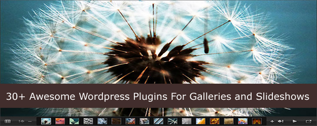
 Slideshow is an awesome way to showcase multiple images representing the brand. Using high quality image slideshows create an everlasting impact on users. Galleries are used to showcase product portfolio in a more interactive manner. For example, if you are a graphic designer, you can showcase your best designs through slideshows and galleries to help visitors make quick decisions.
- Responsive design:
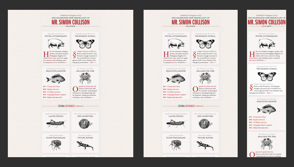
 Majority of people today use their mobile phones to surf the internet and do shopping. Moreover, as per the stats, the number of mobile searches are expected to grow exponentially in the coming months. This means that businesses need to prepare their websites for these devices as well. The year 2015 has undoubtedly seen tremendous growth in this trend. To stay connected with their customers and gain the attention of new visitors, businesses are now focussing on building responsive web designs.
- Material design:
 Last year, Google launched its new style of design language and named it ‘Material Design’. This is actually a maturation of flat design which focuses on clean look and minimal use of color, shapes and typography. Material design combines the principles of flat design with animations and gradients to create clean, modernistic design that focus on UX. While some designers are already implementing this, we can see even more advanced aspects of this design in the coming months.
The bottom line
Trends keep on changing, but the main objective remains the same – to enhance user experience. You need to make sure that the web design you are choosing for your company is relevant to your products/services. Moreover, all the design elements should be user-friendly. Adding feedback form to your website can help you understand the visitor’s views more clearly about your website.


 Long scrolling has become a common trend in 2015 with the demand of creative one page website. Many users now like this layout as it lets them to scroll easily through the information and they need not to load various pages. Moreover, it lets the companies create a storytelling experience for their visitors. This long scrolling is not limited to one page website only, but now you can apply the same technique to site’s sub pages as well such as about us or product page.
 Not only full screen backgrounds, but full screen videos are also gaining momentum these days. Through these videos, companies reflect the ideas and emotions which make the visitors connect more easily with the brand. Users prefer content in a visual format and this can be accounted by the fact that YouTube visitors are growing exponentially every year. In the coming months, this trend will grow even more to build an impression of real life experience.


