Having a good website developed for someone takes more than money. And just because a web designer boasts of skill in web design doesn’t necessarily mean that is what he or she produces. Effective and sustainable web design calls for practice, knowledge, passion and an everyday effort to study and learn new trends.
Here are ten reasons why a particular web design would suck:
A background that is unclear.
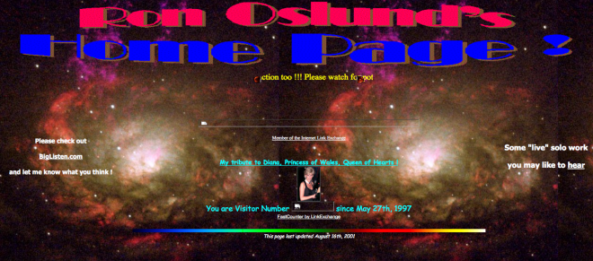
A web design that has a distracting and busy background sucks big time. Any distraction on your background will hide useful information to visitors causing them to miss out on the message you are sending. Visitors will leave your site as soon as they realize that they are not getting what they came looking for.
Noisy website.
Nothing can be as annoying as music playing on a website especially that which no one likes. It gets worse if there are no mute buttons to stop it. No user is coming to your site to listen to music, so if you want a user to come back to your page, do not include any music that sucks.
Wrong choice of colors.
A good web design can be easily ruined by the wrong choice of colors. If you are using a combination of colors, make sure they are rightly put to fit your style and personality. Friendly colors will see your audience returning to your site.
Imbalance.
Balance is a well known design principle that has a direct connection to all elements of design. Proper balance is very helpful in controlling how design flows on a web page. Balance comes in two important concepts: symmetrical and asymmetrical. Incorrect use of either concept brings about an imbalanced layout which downright sucks for a website.
Making a website all about you.
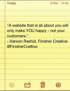
Now this not only sucks, but irritates too. Many website users visit a site with the hope that it will solve their problems or at least make their lives better. They are looking for information or simply want to buy something. If your website is all about yourself, and little of anything else, then no one will find use for it.
A confusing tagline.
The tagline on a website should clearly tell a user what the site is all about in a matter seconds. If it doesn’t, then the website design on such a page sucks. No one has reason to stay on your site longer than necessary just to understand what you are offering, so use a clear tagline.
Using poor design techniques.
When designing your website, do not let poor design get in the way of a visitor who wants to make a conversion. A dull site that appears like a high school project will put off even the hardiest of web surfers and that is a definite sign of a web design that sucks.
Misrepresenting your website.
Websites that promise one thing and then turn around to provide a different thing are classic examples of why a particular web design would suck. For example, if a website says it is in the business of food and beverages, then it has business selling insurance or gym equipment.
Bad navigation to and within the site.
Navigation involves correct and working links, which are like paths in between websites. You will appreciate the fact that a click on a website takes you to where you want to be. Any website that does the opposite and doesn’t answer where a user is, where a user has been, where a user can go next and where the home page is located, surely sucks.
Too many things cluttered on one page.
A webpage that has too much material begging for attention all at the same time makes it difficult for a user to get your focal point. Cramming too much material on your page will confuse your visitors, forcing them out of your site.
How to improve your website design? You would like to read: 10 Easy Ways to Improve Your Website


