Typography for web design
A website design may encompass colors and images during the process of producing a website. However, the importance of text in a website goes beyond colors and images, since it is what a visitor relies on to get precise information, which is his or her reason for visiting your website. A designer should therefore make use of text in proper styles and font so that it becomes easy to read and understand. This essentially is the typography of web design.
As a website developer, you need to acknowledge the fact that content on a site is going to continually change, and it may be difficult to keep changing the typography on a website. The only practical thing a designer can control in his or her website is the typeface and size of that content.
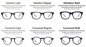
Different types of font
Every person has a different visual look that they prefer. Even so, web pages put a limit on the range of fonts that can be used. This limitation is due to the fact that the fonts on the developer’s computer are not always the same as those installed on the users’ computers. If not, a user will be forced to use the fonts available on their computer even if it does not suit the design and content of your page.
When specifying the font to use on your page, it is important to not only specify one font, but give a list of fonts that can be used on a page.
How typography helps
Typography helps a designer produce a website that is better looking if he or she insists on excellent readability. Text that is properly situated is a powerful tool that complements other elements on your site such as images, videos and charts.
Leading is one common aspect of typography and it is used to refer to the distance between text lines which appear on a webpage. If the lead is extremely wide or close, your viewers are going to have a hard time reading your text.
A great website design can easily be made boring and confusing if too many font faces are used at the same time. It is also best to use a font size that is consistent throughout your webpage.
Choosing correct typography
If the type on your website cannot be read by any visitor, there is no point of it being there in the first place. Correct typography is inclusive of right font size and right line-height which should all be aimed at letting a user enjoy whatever content that is on your page.
A readable type makes your site stand out from others thereby putting you ahead of your competition. The correct typography should be chosen on the basis that it fits in all the designs you wish to implement.
There is no fixed formula to getting a right font size for your website. The simplest way about it is to try different fonts first and then compare them. The bottom line, however, is to ensure that all content is readable.
Popular font in use
A website design should use a standard list of font that will give your users the same page appearance regardless of the computer’s operating system.
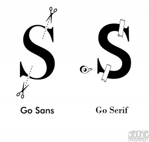
i. Sans-serif fonts
These fonts are commonly used by many websites because they are easy to read on a computer screen.
ii. Sans fonts
The width of every character in Sans font is the same regardless of whether the character is wide or thin, and it is used for most code listings on the web.


