When it comes to web design, going for any random template or visuals isn’t an option. Now building an elegant website that looks like the big brand doesn’t mean you need to shell out huge money. All you need to do is follow the below tips to make your site competitive and big. Let’s have a look:
1) Stay Updated and Follow the Trend
Big Brand websites look amazing because they keep their websites updated with the latest web design trends. Today’s audience has become smart enough to quickly recognize an outdated website. They set a stereotype on the basis of what they see and explore and on the basis of that make assumptions about what is modern and what is outdated. So if you want to make sure that your website looks like big brands, incorporate modern visuals and effects on your site. It will make your site look more impressive and charming. Check out the present UI and UX trends and then design your website accordingly.
2) Think about Branding
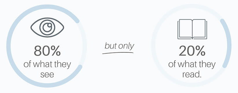
If you want to make your business more competitive, you should think about branding it. Branding means you need to be consistent across all your marketing campaigns and materials. Think about the top brand such as Coca-Cola or Apple, you will notice a coherent voice across all its mediums, be it website, TV commercials, print ads or social media. This means from colors to font and visuals to content, everything should help customers recognize the brand easily. So if you haven’t worked on branding part yet, start it now. Choose your own color theme, fonts, logo, and visuals and keep them consistent across all your marketing campaigns.
3) Avoid Clutter

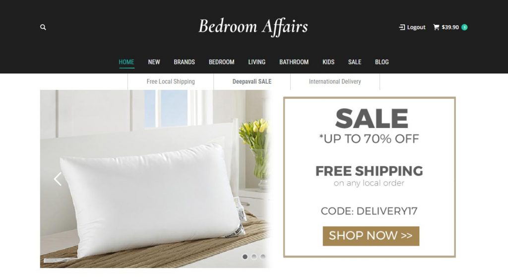
When it comes to professional web design, less is more. Websites that are filled with too many fonts, contents, visuals and other design elements overwhelm the users. They seem less attractive and less professional. Just like a room, a lot of clutter in the website looks messy and ugly. Keeping the design simple and minimalistic, on the other hand, make more room for conversions. A simple web design lets your visitors focus on the main aspect and theme of the website. By using the minimalistic theme, you can simply grasp your customer’s attention towards call-to-action buttons such as “Shop Now” or “Register” that help in the conversion process. To make your call-to-action more prominent, use contrasting colors on the website.
4) Highlight your Products

If you run an eCommerce website, your products should be the highlight on your home page. If you want to make your products stand out, you can opt for product photography. By spending a few more bucks on your marketing campaign, you can make a big difference for your brand. An amazing product photography can go a long way in convincing your site visitors to make a purchase. If you visit the Apple’s website, you will notice how they make their latest products stand out by wonderful product photographs. Apart from posting high-quality product photos on your website, you should also give your customers the ability to zoom in so that they can have a closer look at your product.
5) Make Navigation Easy
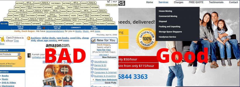
Shoppers get frustrated when they feel lost between different pages. To make their entire browsing experience excellent, make sure to make navigation easy and straightforward. Your site visitors should be easily able to find what they are looking for. To ensure this, make your menu organized and clear. Keep the language simple and easy to understand. If your site contains too many pages or if it is too complex, consider adding a menu of links in your footer as well. If you have a long scrolling website, you can add anchor links that help your visitors visit the exact page of the website where they want to be. Also, make your Call to Action prominent. The moment visitor lands on your website, he should be able to know what your site is all about and where they should click to complete the action that you want them to perform!
6) Simple Logo Stand Out

A logo with too many fonts and colors appear too complex to the eyes. They can be distracting to the user and look very unprofessional. Hence, instead of using too bright or too bold color schemes, try something simple and straightforward. Design a logo that is not only simple but stands out as well at the same time. Your logo design should be able to explain your brand name creatively. Designing a logo that ideally represents your brand isn’t a very easy task, but once done, you should keep it consistent throughout all your marketing campaigns.
7) Use Big Images
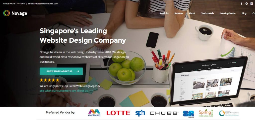
Big Hero Images are quite in trend these days. The big, high-resolution images are one of the easiest ways to make your website look more professional. Beautiful imagery increases user engagement and your website seems more appealing. In fact, this technique is used by some of the biggest brands like Apple. If you have launched a new product and want to draw the user in immediately, a big beautiful photo will do the job perfectly.
Giving your website an edge over your competitors is one part of the story. However, if you want to emerge as a brand, you need to do extra hard work to make it look high-end and professional. Hopefully, these tips will help you make your web design reach the standard of big brands.


