Web design and development can be tiring and time consuming, especially if the project entails new challenges, or putting a freelancer or a team into a territory that is unknown to them. Additionally, time is an important productivity factor because better value is realized at a reasonable price when people work efficiently.
Nevertheless, there are certain steps that you can incorporate in every project. Such steps are routine and should be done quickly so that one can have more time to experiment on new solutions.
Design workflow tips
Color schemes secret
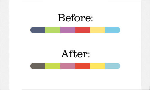
The secret to having color schemes that are cohesive is picking several colors that you want to use and then pick the overall color and tint all your acts towards it. Overlay your “overall color” then play with opacity until you get a color scheme that works for you.
Spacing and aligning
To ensure proper spacing and aligning, create squares in different spaces between the design elements. This reduces time spent and ensures that the elements are spaced and aligned properly.
Ultimate Photoshop’s design workspace
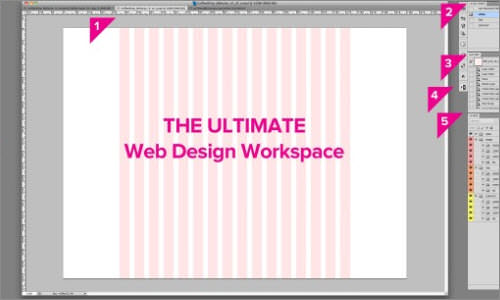
By saving a panel’s position and its current size in the workspace name, it is possible to restore the workspace even when you close the panel or move it. The saved workspace’s name appears in the workspace switcher in the Photoshop application bar, making retrieving it easier.
Coding the workflow
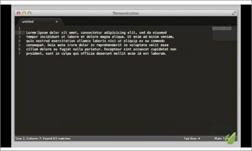
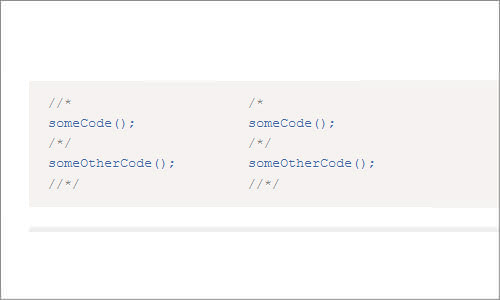
Coding the workflow is a must for Sublime users. Practicing it will turn you into a Sublime ninja.
Speed up the CSS Prototyping
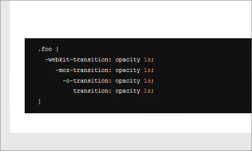
This trick is simple and it allows you to overlay the grid or simply mock-up over the page that you are styling. This trick allows for direct editing of content in a browser as you see how your layout responds to different text lines.
Preventing bleeding of background color on the touch screen
This is an issue that relates to sub-pixel rounding in touch screens. On zooming in, background colors are seen bleeding through the element’s edges with applied background image. However, browsing the thread on the Stack Overflow provides a simple workaround. This may not work for all situations, but it works in some cases.
Vertical editing
Vertical editing is not a new concept. Vertical editing works better when combined with properties that are aligned vertically. It is ideal for big blocks editing of the redundant properties that are vendor-specific. Vertical editing can be triggered in Text Mate by holding the option followed by the use of a mouse to make a selection.
Do the rounded corners right
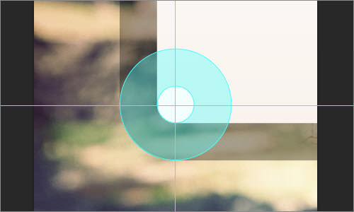
A brilliant web design can be ruined by corners that are nested improperly. They are commonly found in all types of designs, but they are more visible in interfaces and icons. If there are two corners with round edges that run parallel to each other, the radius of the outside corner should be larger and “flowing” round the inside corner. Try to visualize the origin or central point where there is the curve of the first radius. Use the same point in rounding the outer corner. Form curves this way and you will realize the end results with ease.
Tools
There are several tools that can enhance collaboration during the web design process. They include:
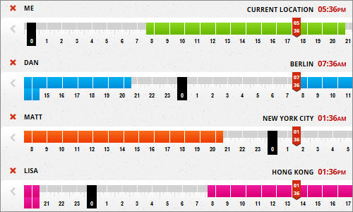
TimeZoneSlider
This tool allows you to include locations and names of the people that are involved so that you can identify the best time to meet.
World Time Buddy
This is a cross of world clock converter and time-zone converter. It is a scheduler for online meetings. Other tools include screenhero and Doodle.
During the web design and development process, you should also use cloud applications such as Dropbox and sideClOUDload which makes the operations of the team that is involved in designing and developing websites easier.

