As a UX designer, you have designed web pages or apps of different forms that users need to choose from. You are also familiar with superior web design practices that are involved in designing those forms. There is a lot that has been said about this issue and you most probably know the best way to position and label form fields and other practices that ensure optimal usability.
However, have you stopped and thought about the effects of a design on the decision-making process of the user? Have you at any time thought about the extent to which the design itself affects people’s choices? Basically, there are many ways of designing a web page or form.
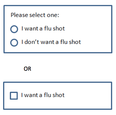
For instance, while designing a system that requires users to indicate if they wish to sign-up for a specific preventative medical process, such as a flu shot, you have different ways from which you can choose how to design that system. You can create a check box that allows users to opt out or in. You can also design it in a way that requires users to choose between two explicit options through radio buttons.
There are questions that should be asked in that case. For instance, would the design matter? Would users make a similar choice no matter the design that is presented to them? Or how would you present the choice or design to lead users into making a different choice?

Defaults Power
A major difference between the designs is the requirement of a default state by the checkbox. Thus, the checkbox appears as unchecked or checked upon display, which is different from radio buttons that do not have a default option. For instance, in the example with an explicit option, the choice is already made by the default option even if the user fails to do anything.
According to research, when there is a default choice, most users do not show any kind of deviation. For instance, when there is a default check in the box, most people do not check it. After all, effort is required to make an explicit decision. Thought, consideration and time are required to evaluate choices before making a decision. Therefore, people are averse and sensitive to the effort that is required to make a choice.
People are also sensitive to the possibility of losing which can cause a sense of regret. This is usually the case when they are unsure about the choice to make and therefore they accept the default choice. A default choice gives people a better feeling than making a choice which might be wrong. Most people are led by the unrealistic expectation of having more time later so that they can make an informed decision. Therefore, procrastination leads them into accepting the default. Explicit action is required to deviate from the provided default. Thus, defaults make making decisions less risky and easier.
Explicit choice web design
Using default is a vital driver of the choices made by most people because they tend to choose default options. The problem of making decisions passively is that one can engender the required committed follow-up for their implementation. Studies have shown that since people are unlikely to look for information that informs their decision, additional wording can make a difference. Thus, including information in the options may affect decision making.
Averting potential loss
When the cost that is associated with the decision such as maintaining a status is made apparent as well as indicated as a loss, people are motivated and compelled to be extra keen in making decisions. They are motivated by the available ways of avoiding loss rather than gain.
Final thought
Defaults can be powerful since they allow users to make passive decisions which ease the process of making decisions. However, there are times when providing an explicit choice is better, especially when this is to be followed by a commitment. Therefore, it is important to comprehend the essence of a web design because it sometimes influences and drives the behavior and perception of the user and hence, the decision outcomes.


