See if your mobile website passes our checklist.

Smartphones are becoming an ever-popular way to browse the internet thanks to the convenience it offers. The smaller screen did initially make it difficult to browse full-sized web pages that were designed for larger screens and a different aspect ratio, but thankfully, that’s beginning to change now. Even Google is starting to rank mobile-friendly sites higher in their search rankings, and many website builders are utilizing responsive web design concepts that can fit both a small and large screen.
As such, we need to start looking at ways to make our websites more mobile friendly. Web building tools can do most of the job for us, but it always helps to pay attention to the smaller details. In this article, we’ve created a 10-point checklist that you should go through in order to see just how friendly your WordPress website is.
1. Use Google PageSpeed to check your website’s performance on mobile platforms
We recommend using Google PageSpeed to analyze and optimize the performance of your website. Google PageSpeed offers many insights and suggestions on how you can improve your website, but you can also leverage Google’s infrastructure to improve your optimization. For instance, you can use Google’s public DNS to bolster the security of your website while also improving the loading speed of your pages. You can also offload popular open-source web development libraries such as jQuery and Web Font Loader to Google’s infrastructure to put less strain on your web host.
2. Compress images so they load faster on mobile connections

Images are the most common offenders when it comes to slow loading speeds. Many people don’t realize that the formats and image sizes they use can drastically affect the performance of a website. For instance, if you’re selling products on your WordPress site and you’re using full-sized images instead of thumbnails, then it can take ten times as long just to load the image, resulting in a poor viewing experience.
Even if you’ve tested the site and seen that the images load quickly, you should remember that mobile connections can be unstable at times, resulting in fluctuating connection speeds that could cause your website to load slowly on a mobile device. Compress images and use different file formats like PNG to make your site load much faster.
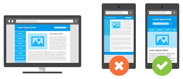
3. Use responsive website layouts and themes that can fit mobile devices
Responsive website layouts generally mean that the content and information on your website will adapt to the size and orientation of the screen that it’s being viewed on. This is the best way to make your website mobile friendly without having to design a completely separate version of your site just to suit mobile devices. This is because you can simply edit or add information to a website through one device and have it automatically scaled and adjusted depending on the platform it’s being viewed on.
This means that adding content to your WordPress site becomes much easier since you don’t need to worry about editing a separate mobile site, but it also means you need to have some experience in web development. Luckily, there are many mobile-friendly templates to help you get started, but many of them are commonly used all over the internet so your site may appear similar to many of your competitors.
4. Search for plugins that can optimize the viewing experience for mobile
WordPress plugins are essentially small tools that you can add to your site for added functionality. Optimization plugins exist for WordPress and they come in many different varieties. For instance, EWWW Image Optimizer will help you automatically reduce image file sizes as you upload them. It works by converting your images into smaller file formats and compressing them while retaining quality. Another plugin would be WP Touch, a plugin that adds an elegant touch-focused theme to your WordPress website.
Plugins are essential for helping you get more functionality out of your WordPress site, but do be warned that some can be detrimental to your site, as we will be explaining in the next tip.
5. Remove pop ups and plugins that could affect the mobile viewing experience

It can be easy to overdo it with the plugins especially if you’re finding more and more ways to add functionality to your website. However, some of these plugins will generate errors or load pop ups that can result in a horrible viewing experience. No one wants to have pop ups appearing as they are browsing and there are times when you might overdo it with the plugins.
Keep your plugin to a minimum and make sure you add them for a reason. Don’t just throw plugins onto your WordPress site for no reason and consider the strain it could add to your website.
6. Stop using slow content platforms such as Flash
Flash is one of the oldest content platforms on the internet. It was originally created in 1996 and has been the source of many privacy and security breaches in the past due to its old and outdated codebase. As a result, it poses a security risk and is often an incompatible technology that just isn’t desirable anymore. If you want to create interesting content, consider using platforms such as HTML5 instead.
If you create Flash-based content, then keep in mind that Android and iOS devices do not natively support Flash, meaning you will miss out on a large percentage of mobile users that do not use a third-party browser for the internet. It’s best to replace any instances of Flash on your WordPress site and replace them with more up-to-date technologies.
7. Utilize adaptive content techniques to scale your website for different platforms

We’ve touched on responsive websites already, but there’s also the concept of adaptive designs. The difference is that instead of being able to respond to the size and orientation of the user’s device, adaptive designs are specifically created for certain widths and sizes. This means that complex coding and expensive themes are not required. However, the downside is that it requires more work and effort to create several versions of the same website.
The advantage of adaptive designs is that only those assets are loaded, meaning more control and further optimization that responsive design doesn’t offer. For example, a website will typically load a full image and scale it down for a mobile platform, but adaptive designs will only load the scaled-down image that is designed for a mobile platform. It is an extreme method to optimize your websites and should only be used if you have a need for cutting-edge performance.
8. Organize links to make your website easier to navigate
You may have tried to browse a website on your phone before, only to realize that it’s incredibly difficult to make your way around all the small and labyrinth of links. Desktop users don’t have much issue with smaller links but do keep in mind that mobile users don’t have the precise control of a mouse or touchpad, meaning it will be more user-friendly with larger buttons and streamlined navigation.
Optimizing the navigation on your website is a given regardless of the platform you’re developing for, but do take note of the effect simple navigation has on your mobile website’s performance.
9. Remove auto-loading content such as videos and large animations

One of the most annoying and data-draining things you could do is add auto-loading content like video and animations. The last thing people want is to see an instant spike in data usage after visiting your website, so we recommend removing any auto-loaded content to maximize mobile performance.
The typical offenders will be video, large animation images and plugins that offer minimal value to your viewers. Hence, you may need to examine your WordPress site and look out for such auto-loading content. Not only will this improve your loading speeds, it will also make for a more enjoyable browsing experience.
10. Include a way to switch between mobile and desktop layouts

It’s always a good idea to include a button or link that allows your viewers to switch between a mobile and desktop version of a website. There are a couple of reasons for this. For one, your users might be accustomed to the desktop version of your site and prefer it despite the smaller screen. Another reason could be that your viewer is actually on a mobile windows device like a tablet and would prefer to have the larger buttons of the mobile version. You might also have content that is specific to the desktop version of the site and your users may want to access it instead of the mobile-specific site.
Adding an option to switch between mobile and desktop layouts is simple. However, some responsive website layouts do not support this option and you may need to switch to adaptive web design instead.
Conclusion
Speaking from experience, we recommend these 10 ways to ensure your WordPress site is ready and friendly for mobile users. However, should you find your website missing a few of these points or have no idea where to start, don’t hesitate to contact the team at Novage for more information. Whether you are planning a new website or looking to optimize an existing website, we provide a variety of web development services that will meet your needs perfectly.