Ecommerce website owners are always on a lookout for search engine optimization techniques. And this has led to the evolution of many notable research fields like search engine analytics, business intelligence, market research and analysis, etc. The analysis reports generated therein are used to formulate website designs that ensure large traffic inflow.
However a heavy incoming traffic doesn’t guarantee higher sales. And so it’s important to understand the factors affecting lead generation and conversion.
Let us focus on some impactful design aspects:
A Pleasant Navigation Experience
Business websites are not confined to a single page. And hence they involve different interaction points like links, slider movements, vertical and horizontal scrolling, filling information forms, commenting feedbacks and more. For notifying visitors of these actions it requires globally accepted icons. And therefore it is advised to use standard icons and controls that can be comprehended by majority site visitors.
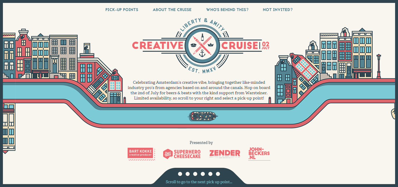
Nonetheless a bit of creativity always gathers recognition. A successful website is an effective combination of appeal with utility. One of the best examples is the Netherlands cruise website that exquisitely blends purpose and creativity to produce an award winning website that succeeds in impressing even those who have never experienced a cruise journey. And instigates people to soon enrol themselves for one. A website that persuades users to avail a company’s service is praiseworthy.
Moreover an easy-to-use website ranks higher in user acceptance than a content rich website.
Mobile Optimized Design Elements
Mobility is in. If you still haven’t encashed on it, you’ve lost potential customers to your competitors who have capitalized their mobile presence. To humor smartphone audiences which cover a major portion these days it’s vital to set afloat a mobile website.
But for start-ups and small-to-medium companies investing separately in a mobile site is an added expenditure. Responsive web design is a respite for such companies. In the end both responsive and mobile sites have their pros and cons. Where a responsive website saves expenses, a dedicated mobile site has a sound rendering capacity.
However you can improve a responsive site’s load time by adhering to a few design principles:
- Use simple interface elements that load quickly
- Use textual content to minimum
- Reduce http requests
- Avoid heavy images and other media
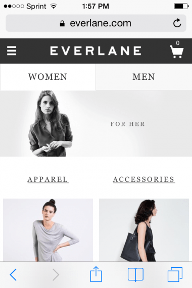
Online clothing retailer Everlane’s mobile site has a clean navigation, contemporary display, clear product categorization and speedy operation. Such a site ensures quick action from visitors.
While every developer would adopt latest technologies in their website development, old browsers may have a problem displaying advanced features. Here predictive JavaScript can help you detect browsers and accordingly modify the presentation to prevent loading hassles.
Accurate Product Descriptions and Comparisons
Words can make a difference when it comes to selling things. Even though images speak volumes there are many aspects that a picture fails to capture. Several key product features which are important for consumers like weight, material, durability and most importantly price need to be displayed in noticeable fonts.
Sometimes the way products are described fascinate a user to such an extent that they are compelled to buy. A smart salesman makes a sale by successfully correlating the product with the customer. On web this can be achieved by posting customized product descriptions. Customers can’t feel the virtual product images and this leaves them with no other option than to rely on your descriptions (However a fake a description brings bad credit).
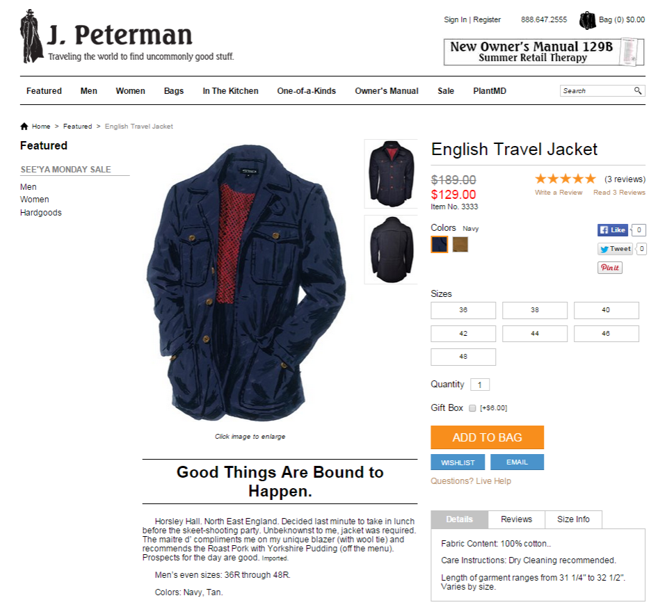
An international apparel brand J Peterman adopts an articulate style of describing products. Such narratives help visualize the product better. Even if a consumer has no serious buying intention such descriptions provide him the reason.
A relatable description works better than praises.
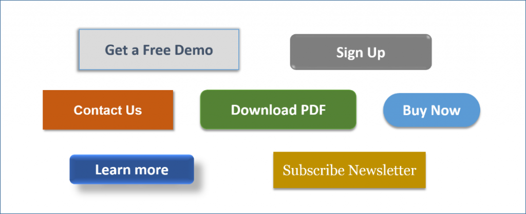
Well-defined Call To Actions
Highlighted Call-to-Action buttons propel users to act. This action can be anything from buying a product to registering on the site. This CTA button guides users how to interact with the site. And hence its location and appearance are crucial for drawing visitor attention.
Text on a label is more noticeable than a plain link below the content. And a highlighted button is all the more eye catching.
A few guidelines can help you design a noticeable CTA:
- Restrict the words to minimum.
- A lighter CTA button goes well with dark background while a dark CTA button would suit a light background color.
- However the CTA button’s color should not stand out from rest of the theme, the contrast should be well managed.
- The font style (typography) should be readable and subtly stylish.
- Ideal location for the CTA button is just below the content block.
These presentation guidelines can also be applied to discounts and offers.
Adding an urgent tone to your Call to Action works for ecommerce portals. And to avail maximum advantage a decreasing digital clock can be attached. But remember a digital clock applies only to time bound offers that have an expiry date.
Engaging User Experience
Always use whitespaces in your designs. This renders clarity and orderliness to your website and enhances readability by emphasizing only the things you want to emphasize.
A memorable user experience comprises a spellbinding story telling technique which compels visitors to stay longer and peruse the site.
Different website components like fonts, content, media, utility controls and many more coherently create an engaging user experience.
Chicago’s hat manufacturer Optimo’s ecommerce website gets it just right by a simple concept and graceful depiction. Keeping best customer interests in mind the site offers two options – video and text for viewing any category.

On the other hand Blacknegative for telling their success stories accurately complements the animation with background to produce an exquisite effect.
Conclusion
You may stock out-of-the-world products that are a benchmark by themselves, but if your website fails at selling them it’s of no use. A shop that has a clean counter, well managed products and a friendly shopkeeper who greets visitors with a smile witnesses highest footfalls and subsequent sales.