It’s no secret that website design and development technology changes and grows as rapidly as a bamboo shoot that just sprung from the ground. Technological advancements have in no small way contributed to this, first enabling consumers to access the internet using their mobile devices followed by the increased application of digital marketing strategies to stand against increased competition for the web attention of a limited niche of consumers.
The Singapore government has not been left behind in this quest; the websites we see today are a far cry from anything we had 15 years ago at the turn of the century. Today, and over the years, there has been increased focus on user experience, which is the top consideration for search engines in indexing and ranking web pages for various consumer needs.
In the following paragraphs, we analyze five Singapore government websites, travelling with them through their journey into the 21st century, and the current sites which provide much more value to visitors now than they did 15 years ago. The websites studied include:
www.ica.gov.sg
www.mom.gov.sg/
mycpf.cpf.gov.sg/Members
www.moe.gov.sg/
www.pmo.gov.sg
Immigration & Checkpoint Authority
The year 2003

In 2003, the official Immigrations and Checkpoints Authority website was checkered by an overall bland design pattern. There was too much use of dark colors, with a banner image design that seemed unnatural to the consumer’s eyes. Aside from that, elements were arranged in a rather rigid way, the columnar format which felt very wordy (even though it was accepted then).
Remember this was before fluid layouts; pages were static and inconsistent regardless of the viewing screen. The standard therefore was to cram as much information on the viewable screen as possible. Images, which occupy lots of space, were used very sparingly. The idea was to enable visitors find information, and that’s about it.
The year 2008
ICA introduced a flash banner to their homepage, featuring a slideshow of images collected from various sources. You can see the focus shifting from simply being an information resource to actually giving users an enjoyable experience. The layout also changed, with most of the information being tucked away in relevant links to guide users towards what they want while still sharing some vital information.
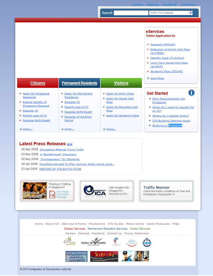
2012 – Present

The site today is not much different from what it was in 2008. Small changes like the increase in font sizes and reduction in function can be seen. The flash banner was also removed, possibly because it added little value to users of the site. However, the current site provides most of what contributes to good user experience – fluid layouts and mobile friendly design, important information links readily accessible from the homepage, and a generally minimalistic, but attractive design.
Ministry of Manpower
The year 2000
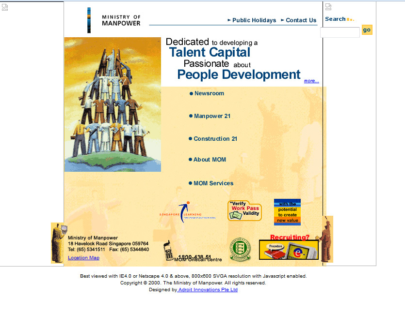
The Ministry of Manpower website in 2000 can only be described in one word: messy. Various elements scattered haphazardly throughout the homepage – contacts, search buttons, no exact banner, and sponsors, among others. Everything was all over.
However, the MOM was always leading on design trends – their web animations were done on GIF, they did have fluid layouts (HTML Table-based layouts), which is a plus for them, given that fluid layouts were not as popular back in those days.
The year 2003
2003’s redesign brought some kind of structure and massive improvements to the overall look, feel and layout of the MOM website. A banner was installed and the layout was condensed and simplified, with important links to information for different users easily visible and accessible from the home page.
A navigation pane was installed for the main website pages. On the overall sense, the layout was simplified, following a minimalistic template. GIF with lamination was still used. The new site, however, could best be accessed on Internet Explorer 5 and Netscape 4.7 or beyond with resolutions of 800×600; earlier versions did not render the site well.
Improvements: the layouts were much clearer and navigation was organized to the top and left pane as is commonly recommended. Their homepage also had a lot more information to guide a visitor towards exactly what they need, meaning that visitors wouldn’t spend more time trying to locate necessary resources buried deeper within the site.
The year 2006
The left-hand pane was dispensed with in favor of a single navigation/menu pane at the top, with the various categories accessible from there. It provided more space to fit various layout elements in a clear way and also provided additional space for more user information to be placed on the home page.
The year 2010
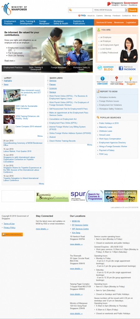
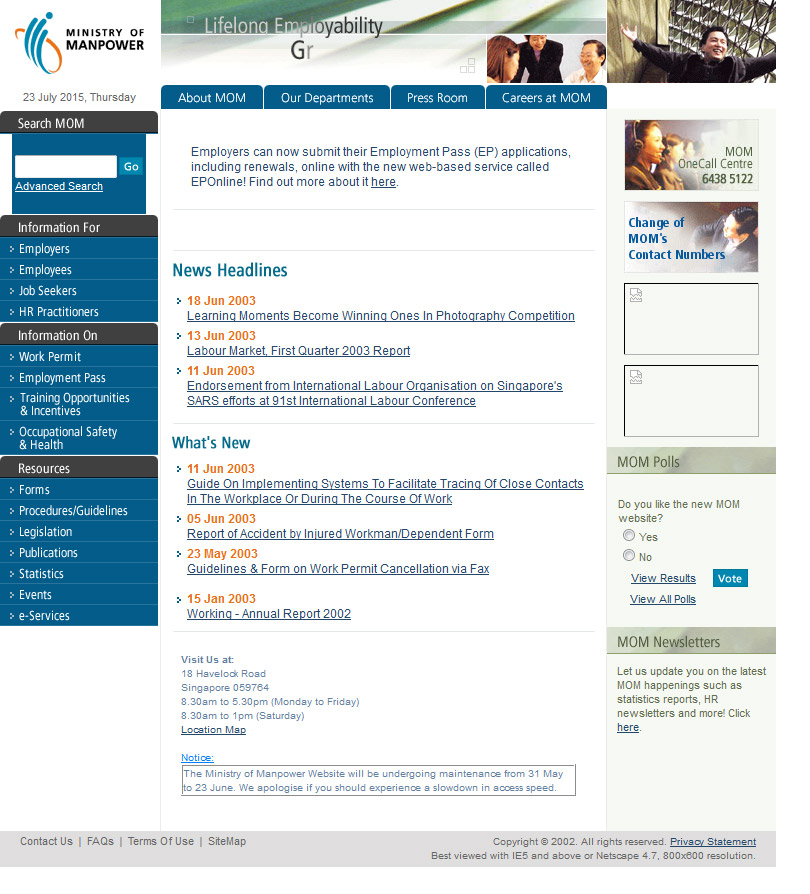
Following the explosion of social media and the blogging culture, MOM added a blog to their site, with social media widgets added in to make connections between the site and various social media sites seamless. A bigger icon and friendly images enabled users identify better with the site, improving the overall user experience for visitors. It is clear that this was a site keen on taking advantage of the design trends of the time.
The year 2013
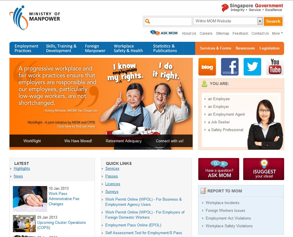
The year 2015

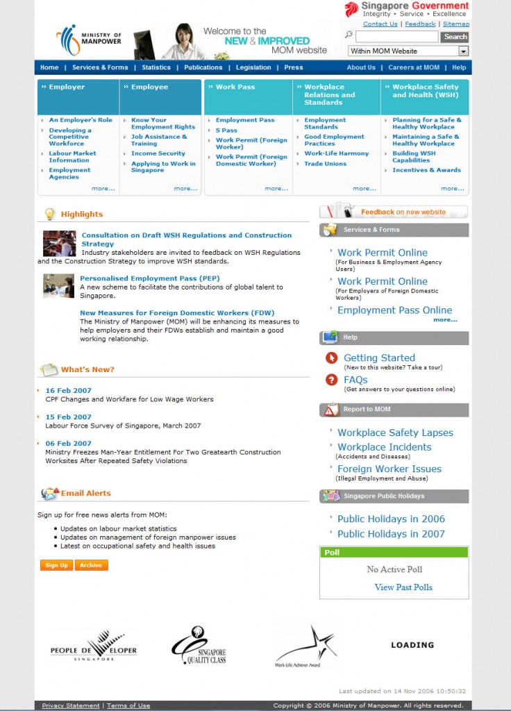
The latest improvements are solely focused on enhancing user experience for the site. For every new visitor, there is a tour of the site, with the search site function highlighted to enable users navigate to the details they need easily. They chose a color combination that’s comfortable on the eyes, and with a rating system to generate more feedback for future improvements.
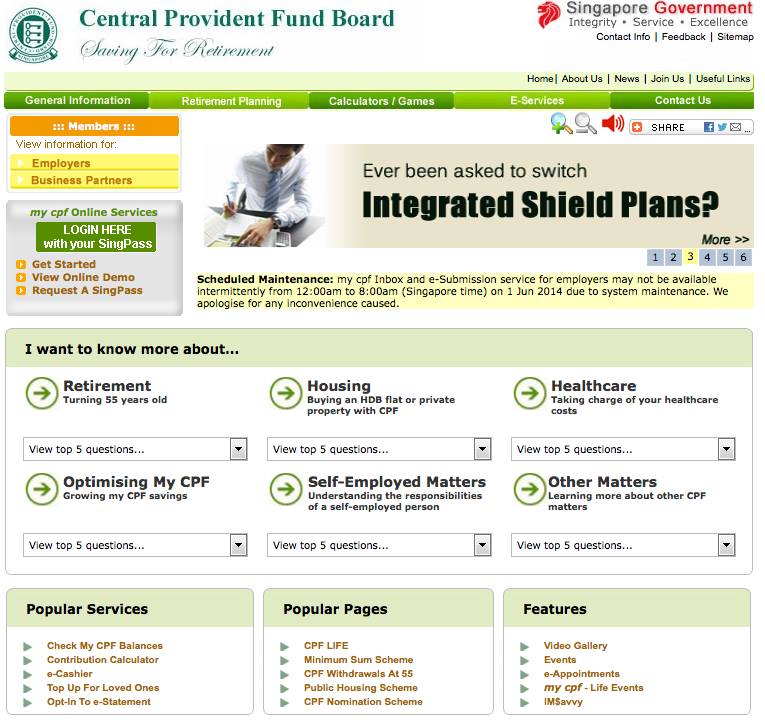
Central Provident Fund Board
Before 2004, the member of CPF could only access CPF board resources using their bank paybooks, or they’d have to go to the back to have their account numbers endorsed before applying for a withdrawal. It wasn’t until 2006 that members could access the CPF Board site for e-withdrawal services, using their SingPass ID and NRIC numbers. But their website has come a long way to get where it is today.
The year 2004
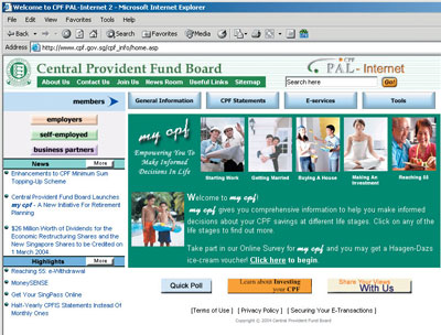
Like many other government sites, the first design in 2004 was just messy. The first thing that hit you looking at that image is that there was so much information you possibly wouldn’t know where to start. The menus were placed using the button system, which was common then and they had HTML-Table based layouts.
The year 2006
There was a massive improvement to the layout design; elements were organized in a clear layout with user friendly navigation. The buttons were eliminated.
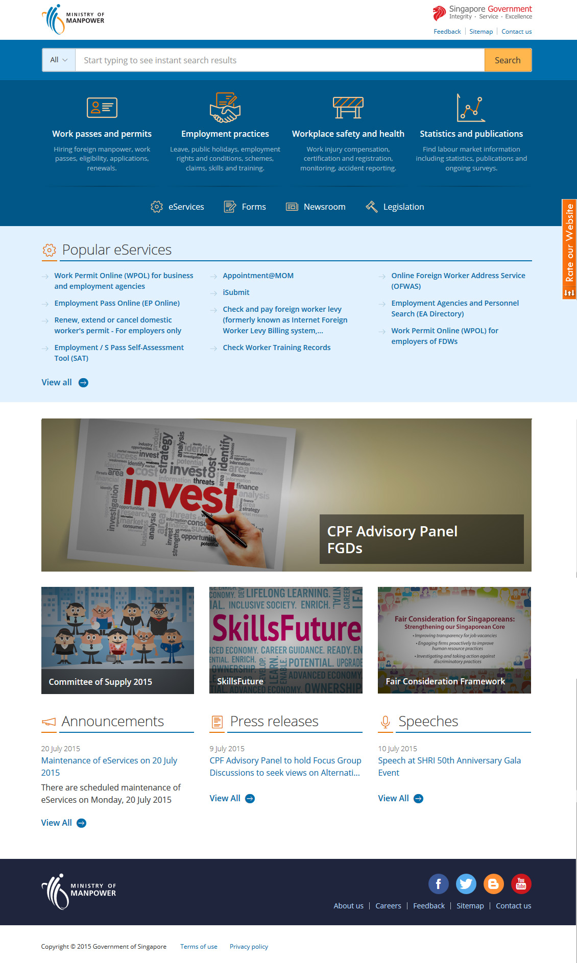
Present
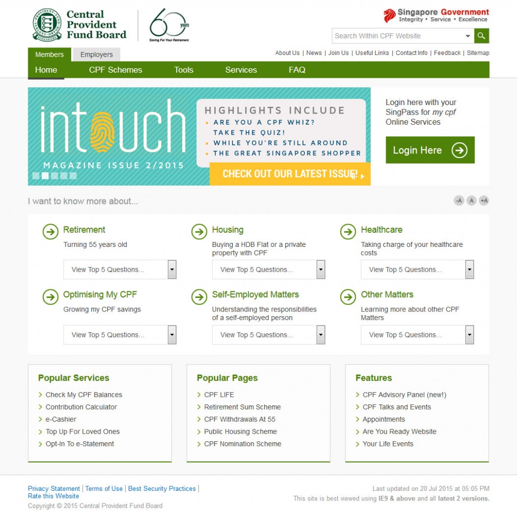
More improvements can be seen today: flat design, more friendly and inviting color combinations, better typographical setting and a bigger font for better readability. The minimalist, organized design enhances user experience, providing adequate information for a majority of users without overloading their brain with information, elements and layout designs.
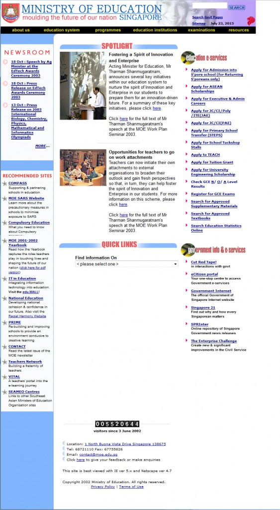
Ministry of Education Singapore
The year 2002
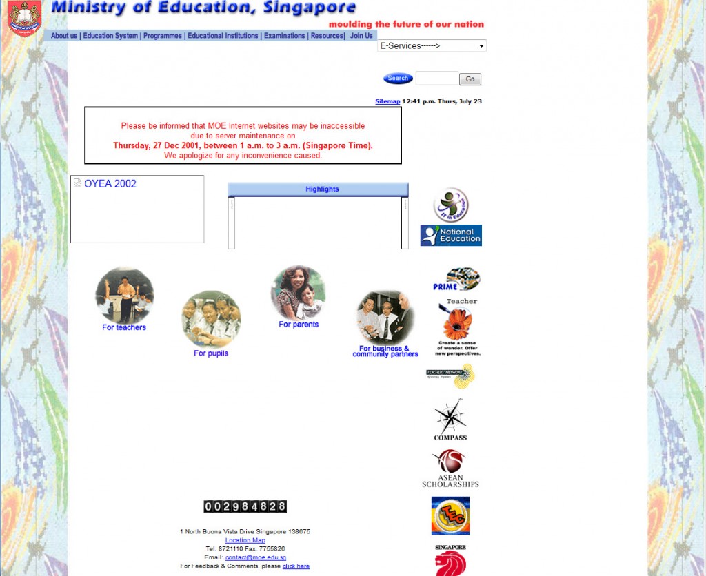
It’s not easy to say exactly what layout design inspired this 2002 design of the Ministry of Education’s website. There was no meaningful background; icons and images were scattered in a messy way throughout the site and there wasn’t enough information for users on the homepage. They, however, used fluid layouts.
The year 2003
Almost as though they were compensating for the lack of information in the previous design, this design immediately assaulted your senses with too much information – too many words. The design was developed by table, and had some kind of solid structure which could be followed by users.
The year 2008
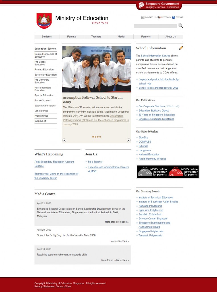
This is a more acceptable scheme, with enough information to get users where they want to go, but not so much that users get overwhelmed. The change of color theme from blue to red introduces a nice contrast with the other elements on the page, and falls in line with the logo color to introduce more unity in the design.
The year 2015
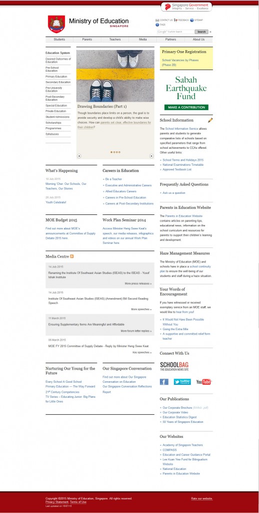
This is not much different from the previous version. The only improvements were addition of social media share icons, which could do with a little more emphasis – perhaps change in placement from the bottom to the top, with larger icons. Also, the standardized Singapore Gov. icon was introduced.
Prime Minister’s Office (PMO)
The year 2001
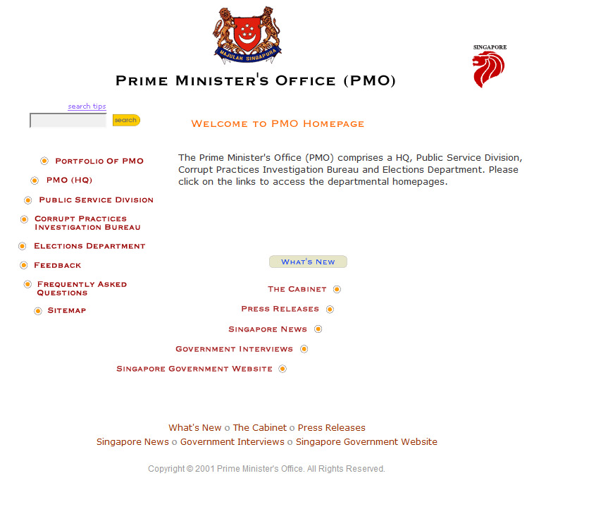
While not outrightly messy, this design of the Prime Minister’s office website was simplistic, developed by table, though it had no valuable information to be found on the homepage. The design was just plain boring, with no standard to speak of.
The year 2006
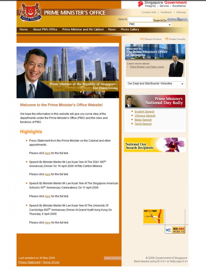
This was a huge improvement with a friendly image to attach our Prime Minister of Singapore to the site, and users could identify with it more meaningfully. However, the design was still a little simplistic, feeling more like a personal blog than a serious government website.
The year 2011
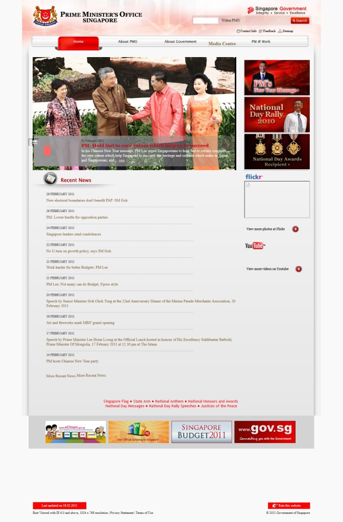
A comfortable color choice, falling more in tune with the logo and users’ senses. The navigation banner design was improved, structured, yet captivating. The slide banner is also a nice touch, highlighting the most important information for sites.
The year 2013
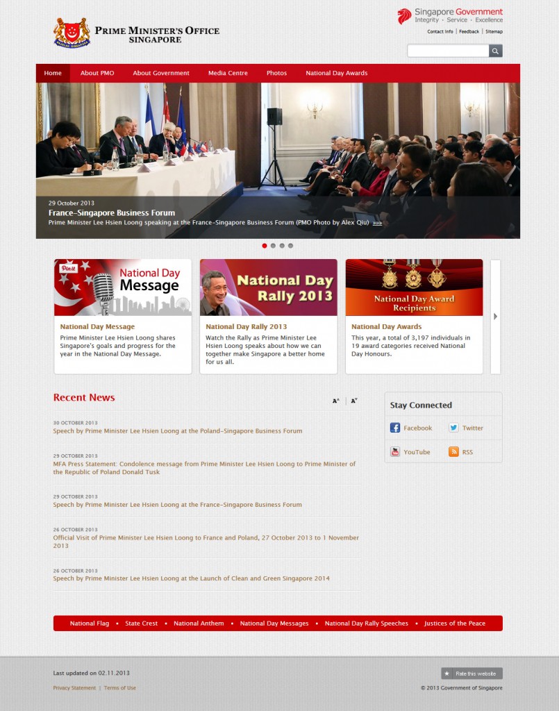
The site has a certain clean and clear look and feel to it: the color theme is comfortable for the eyes and flows into other elements of the page. A bigger banner image attracts user attention. Specific sections have been included to highlight important news pieces with images to break the monotony of text.
Font sizes and functions have been reduced, with a grid layout design being used to create order. Finally, there’s integration with social media through icons in a clearly visible section of the page.